
You can only call a project "that thing I'm working on" for so long. Eventually, you should settle on a name for it. Usually for me, this involves anything from ten minutes to an hour of brainstorming while sitting in front of a text editor. The resulting notes.txt usually has three joke names, two 'safe' choices, and one or two that I really want to use, but are either too punny or too obscure to use.
For my latest project, I just couldn't stop. I came up with three new names a day for a week. This is the story of my hyperlogographia.
Our journey begins when I get the itch to code a game that takes place in the real world, not cyberspace. A first-person-shooter, one that obeys the well-researched and widely-known Laws of Physics. Think of the possibilites! Your character customization can include important choices like "weight class" and "armor choice" and any number of well known physical weapons! And you know, I bet gravity-manipulation isn't that hard to implement. After developing a cyberspace game and a social-interaction-driven board game, this sounds like a welcome respite from creating mechanics from scratch. And so I boot up Unity.
In order to start a project in Unity, you need to name it. This immediately leads to "RPG Paralysis," and not the kind that affects your Half-Orc Barbarian, but the kind that you get when you are asked to name your character. Eager to code, and aware that agonizing over this particular decision may sideline me, I typed in Gravdrone Wars and tried not to wince. There. Done (for now.) Time to code a sniper rifle!
Two and a half weeks pass, and I finally get rid of the burning desire to code thermal bloom and invisibility shaders. Let's make some minimal marketing material, stick it on Github, and see what some playtesters think.
At this point, the game's high-flying ambitions have calmed down quite a bit, and it is now an arena-based first person shooter, with the main gimmick being a thermal mode and an echolocation mode. The real hook are mechanics to give players three spectra in which to hunt their enemies, each with corresponding counters, strengths, and weaknesses. The player avatars are robots with little hovering rockets, equipped with sniper rifles, laser beams, and grenade launchers.
The first names that spring to mind all revolve around violence and the electromagnetic spectrum. The ideas here are usually of the "throw immediately away" variety. VISUAL CONFRONTATION, FIGHTER OPTIC and SPECSCRUM are all pretty forgettable, but satisfy the "fight and fiber" theme. After thinking about the (at this point half-theoretical) core gameplay, I alight upon a name that doesn't immediately provoke eyerolls. HIDE & SEEK & DESTROY sounds respectable, marketable even. I could see H&S&K on...things, both digital and physical. Okay, I tell myself that one could work pretty well. But my brain wasn't done yet.
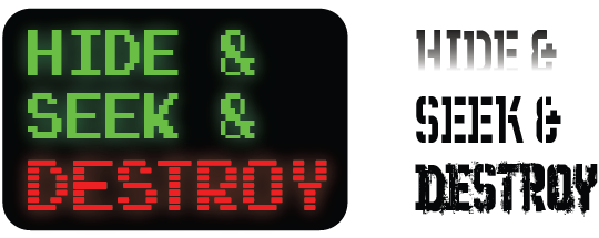
It's of first draft quality, at its best. As I'm frustratingly tweaking the HIDE & SEEK & DESTROY logo in Illustrator, I get another idea out of the blue: GRAVELENGTH. This too, I can see on banners and letterheads. This one is much closer to the "fight and fiber" theme I had previously explored. I sketch out a logo in trusty Illustrator.

This one is more exciting. Look at that sine wave! Imagine it pulsing in rainbow colors. How can anything be better than this, I ask myself. Just as I'm putting the final touches on a variant logo, doubt starts creeping in. Doesn't "grave" remind you of zombie games? No, I hurriedly tell myself, it's not like that. Trying to seek confirmation from my wife at home, I show off my new logo.
"It looks good! Good job. But if I'm being honest, it makes me think of a zombie game." I laugh it off, offer up a weak defense, say that it should be fine, but in the back of my head the opposition party, the anti-Gravelengths, just overthrew the logo government.
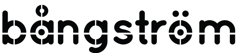
Fighting. Light. Wavelength. Robots. Drones. All of the permutations and puns of these basic words have been exhausted. I start browsing wikipedia pages for related terms and phrases. Surely something lends itself to a little wordplay? Finally, I strike something with portmanteauability. Ångström. The meaning is there: a unit of measure commonly used for wavelengths of light. Look at all the -ang rhymes! They practically write themselves! CLANGSTROM is a great way to emphasize the robots. BANGSTROM is even better, with an explosive onomonopoeia to boot! If I can find a good geometric font, I just add little reticles in the b's, a's and o's, and the logo looks fantastic. THIS is the one.
And then I get feedback.
"Bangstrom? LOL"
"Yeah bangstrom makes me think of a porn game. I'm sorry just being honest"
...
Bangstrom, you flew so high, and you fell so low. You will be missed. I open up Illustrator again after the little funeral in my head finishes up.
Back to the drawing board. There's still CLANGSTROM, I tell myself . A font with hard lines and harsh corners will give it that robotic look. For a bonus, the "Å" looks like a little nut! Very robotic-y.
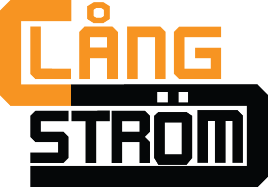
This one is perfectly fine I try and tell myself, it doesn't matter that it's not as good as Bangstrom. This far into the journey, I should have been happy with Awesome Logo #3. I should have called it quits and slapped CLANGSTROM on the title menu. I should have. But, of course, I didn't.

Get it? REFR|ACTION? That rainbow triangle is a bit much, let's try another design...

Much simpler. Much cleaner. That O-as-targeting-reticle is on point. This design gets good reviews from friends as well. I crop it, export it to PNG, save my scratch file, and close down Illustrator. It's either REFR|ACTION or CLANGSTROM. The long nights of logomania are over.
I've spent hours upon hours on names for projects, and logos for those names, only to throw all but one away. On the upside, the logo design practice is probably worth the whole experience. On the downside, I could have fixed a dozen bugs and added two new features to any one of my projects in the same time frame.
Any good narrative needs some kind of end, some reflection on what it all means. There's only one good moral to this story that I can see: I need to stop making logos.

I spent an hour making this last logo (and a few others I threw away) because I opened my Illustrator logo file to export single images for this blog post.
As of this writing, I'm still not sure which one I'm going to pick.
¯\_(ツ)_/¯
-Alex